In the competitive landscape of beauty services, Cheongdam occupies a distinctive niche by dedicating itself to advanced technology in skincare delivery, simplifying the K-beauty routine for its customers.
In the competitive landscape of beauty services, Cheongdam occupies a distinctive niche by dedicating itself to advanced technology in skincare delivery, simplifying the K-beauty routine for its customers.
As Cheongdam experiences rapid growth, there is a need for a more refined identity that communicates its commitment to providing personalized services. Beyond being recognized for adopting cutting-edge technology, Cheongdam is also focused on conveying qualities such as high performance, results-driven approaches, and a human-centric philosophy.
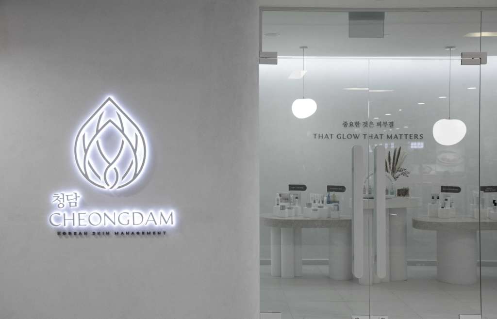
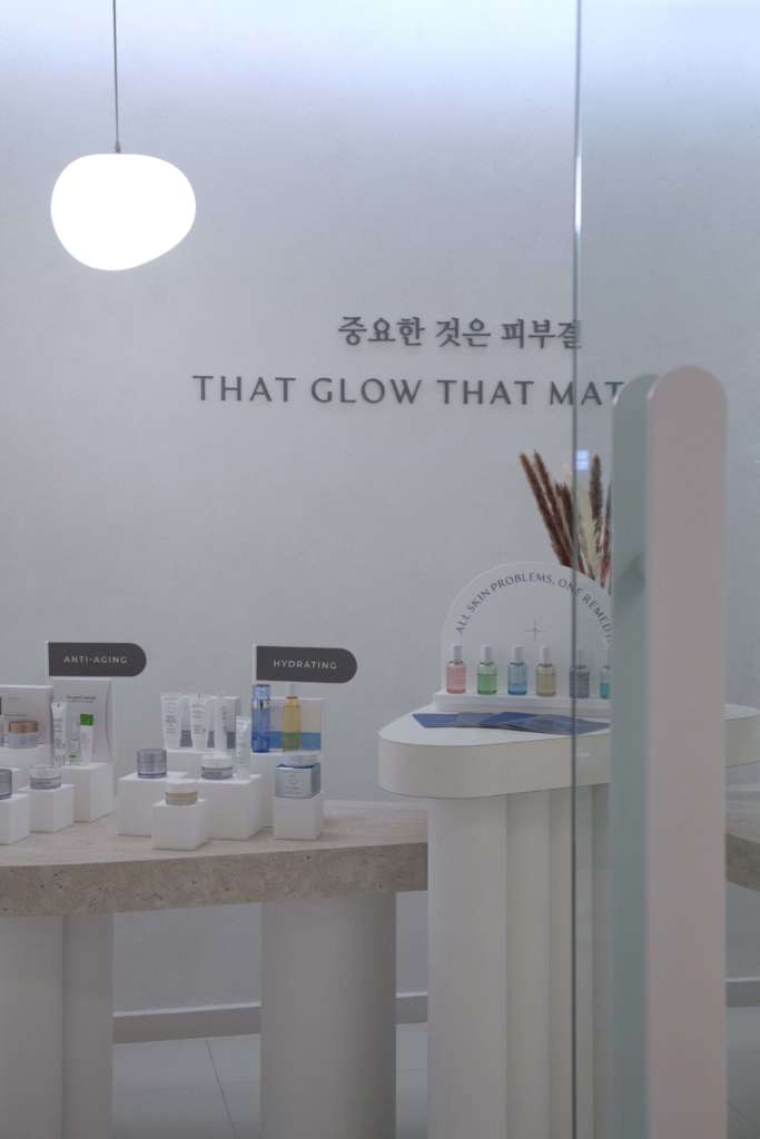
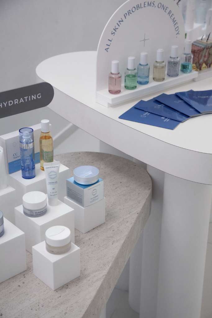
To achieve this, we developed a design language that is exceptionally clean, sensualized, and straightforward. This design approach reinforces the concept of “advanced beauty” and emphasizes transparency regarding ingredients and treatments. The existing logo underwent a modern uplift, accompanied by a new color palette and typography as part of the overall identity refresh.
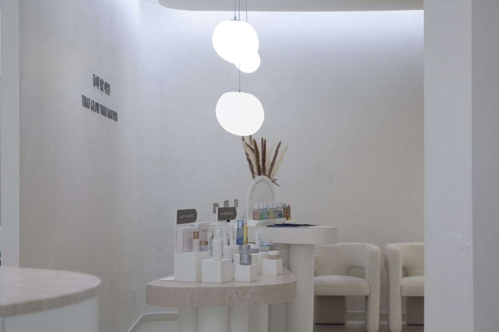
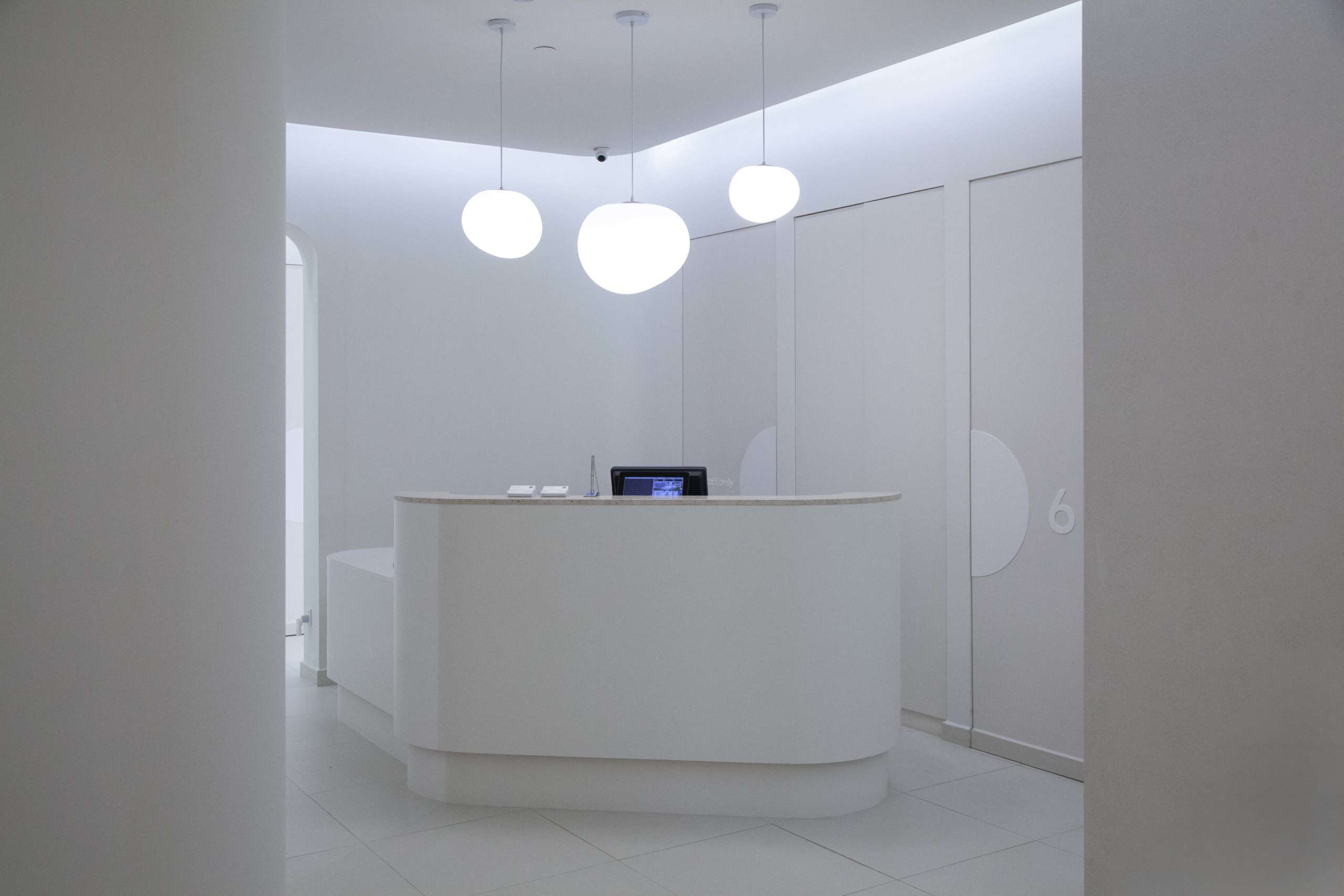
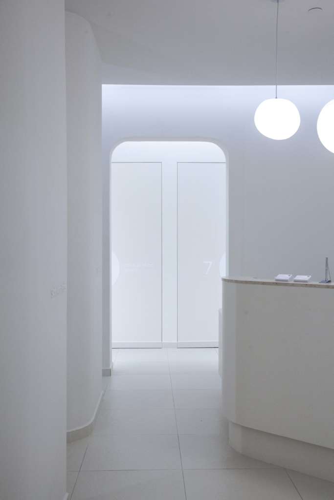
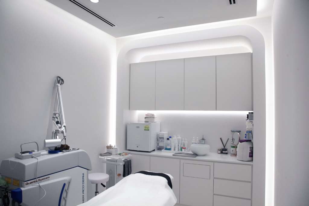
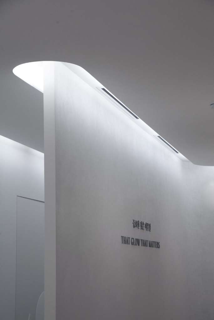
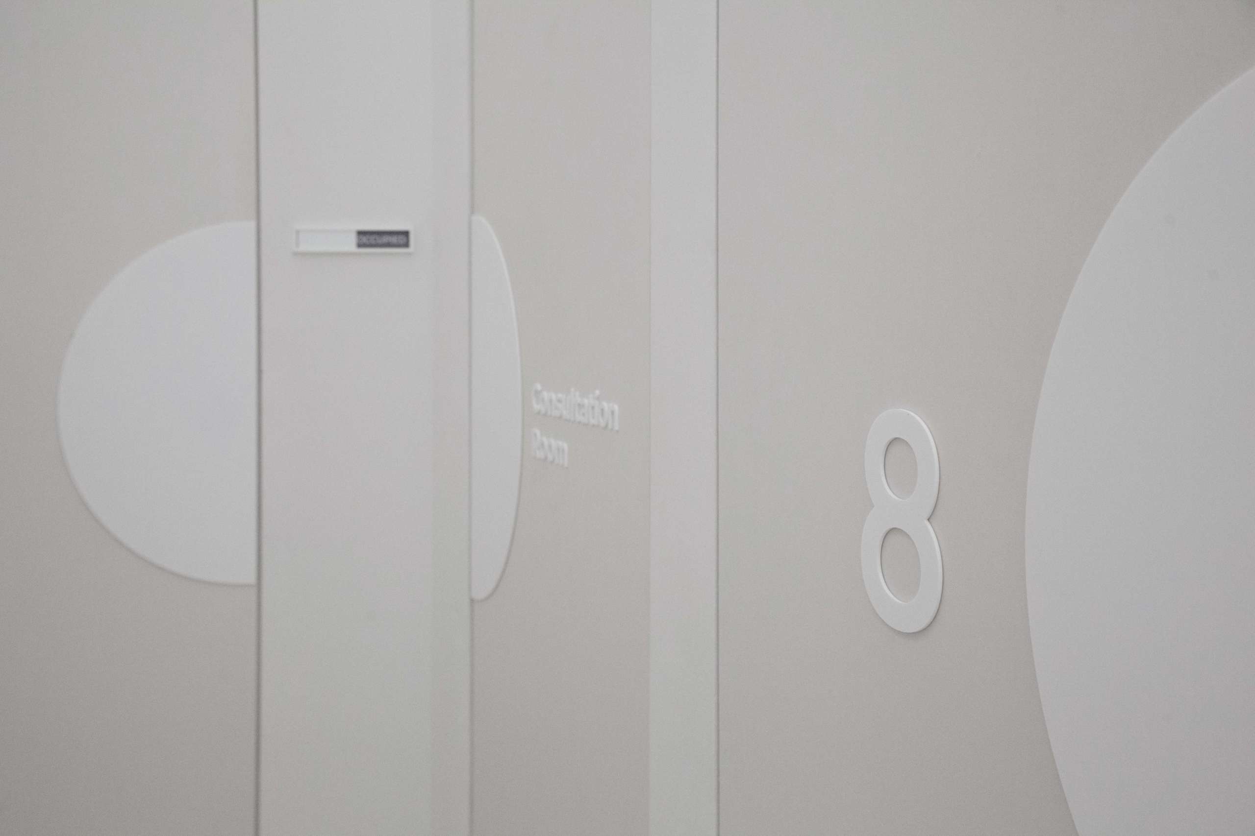
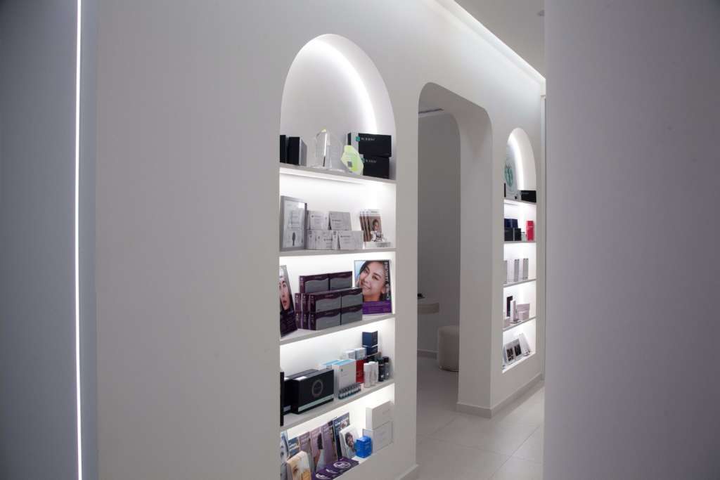
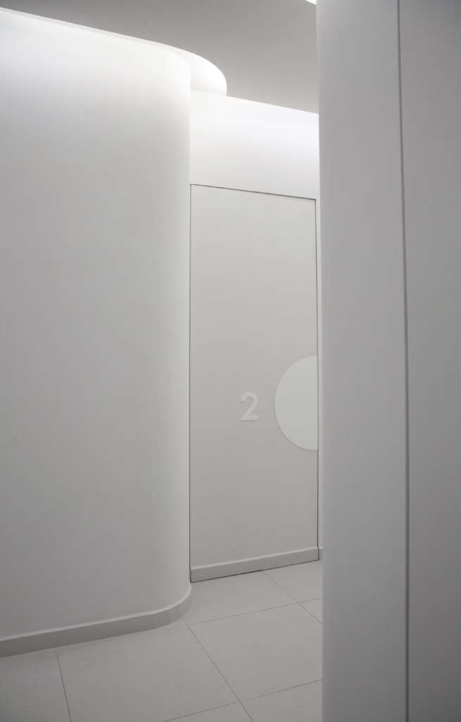
In the spatial context, the new United Square store sets the precedence for future expansions. The store aspires to redefine the notion of high-tech beauty, introducing the concept of “clear skin.” By incorporating multiple curved surfaces and soft contours throughout the interior space, we aimed to create a beautifully chic, all-white environment that exudes warmth. The key to achieving this aesthetic lies in layering of lighting and textures, resulting in a captivating, warm, and engaging space that resonates with Cheongdam’s customers.